
Winter Painting Recommendations: What You Should and Should Not Do
January 26, 2018
Complete Your Stairway with These Painting Tips
February 28, 2018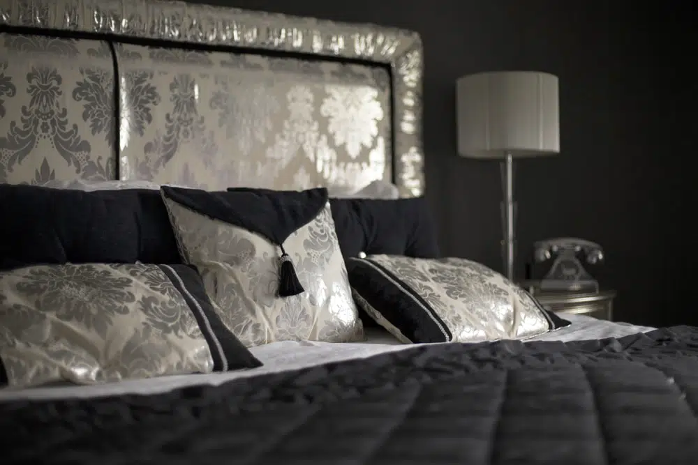
There’s no need to ask if colors affect your mood and your mind. Most people accept that colors have this effect. People certainly believe that they do. In fact, there is scientific evidence to support this as well.
That’s why it’s so important to make the right choices when you’re planning your master suite. If it’s truly going to be an oasis for you and your mate, you should follow your feelings about favorite colors, though you might also check into some of the guidelines on this subject.
In addition to selecting specific colors from the array of options, designers will suggest that you pay particular attention to two elements: brightness and saturation. If you have a green or a red that almost says “green” or “red” aloud when you see it, you’re looking at color saturation. For example, the term “khaki” refers to a hue that is in the green area but is certainly not a saturated color. You might want to use this factor when choosing from the range of your favorite colors because a choice can be less saturated but still be bright.
What Happens?
So, what is the effect of a bright color that displays a lower degree of saturation? In a word, relaxation. The opposite is generally true when a hue is saturated but necessarily bright. This might be thought of as an energy-producing color. You’ve certainly read about or heard about warm colors such as red or cool colors such as blue. Your body and mind can respond to these colors by making you feel warmer or cooler, an important detail when looking for ideas to finish your master suite oasis.
It’s also important to consider the saturation factor if space is a consideration for your room. Lighter colors will make walls seem a bit further away, creating the sense of additional space. Dark colors can make you feel a bit more “closed in,” though this could work to your advantage in the correct setting. What you’ll need to do when planning for a master suite to fit your personal tastes is consider what you want the room to “feel like.”
Specifically
Some couples decide that the combination of black and white is perfect for a comforting look as long as the details are not too industrial. It’s important to make the right choices for using these basic colors because the contrast can give your suite a remarkable appearance. Others feel that blue is the best choice because it delivers the cool feeling mentioned earlier and also brings the room an overall atmosphere of serenity. When this is your objective, it’s important to pay attention to the concepts of saturation and brightness so your blue color doesn’t become intense.
Green certainly gives your room a natural, environmental feel. The correct choice of tone (saturation and brightness) can mean a calming effect in a room where this is the overall purpose. Be sure that you give this choice plenty of attention during the planning stage. You are creating an oasis, after all.

