
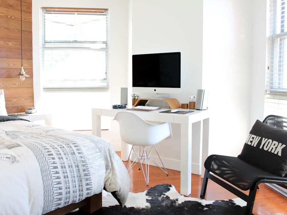
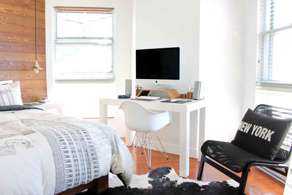
What Color Should I Paint My Bedroom? A Guide to Decide
March 7, 2024
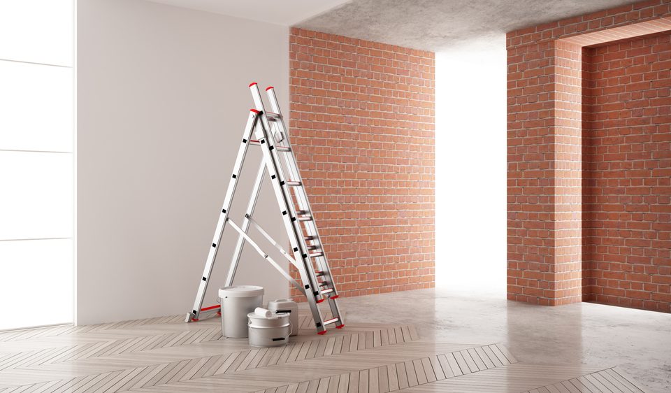
Optimal Timing for Wall Repainting: A Complete Guide
April 3, 2024
Deciding on the perfect color to paint your kitchen is more than just picking a shade you like. It’s about setting a mood, making space feel bigger or cozier, and complementing the natural light that fills the room. We’ll dive into how colors can impact your kitchen’s look and feel, from brightening up a small space to creating a warm spot for family gatherings.
You’ll learn how to match your paint choice with the amount of sunlight streaming through your windows, ensuring your kitchen looks inviting at any time of day. Moreover, we’ll unveil the hottest color trends of this year as well as classic choices that guarantee enduring elegance.
Diving into the nitty-gritty, we navigate through the maze of picking a paint finish that suits various kitchen zones and harmonizes it with your cabinetry, worktops, and gadgets, blending practicality with aesthetic appeal. Finally, yet importantly, discover how personal preference plays into choosing between what’s trendy and what feels right for you.
Table of Contents:
- Understanding the Impact of Kitchen Colors
- The Role of Natural Light in Color Selection
- Trending Kitchen Paint Colors for This Year
- Timeless Colors for Every Kitchen Style
- How to Choose the Right Paint Finish
- Color Coordination with Kitchen Elements
- Practical Tips for Testing Paint Colors
- The Influence of Color Trends vs. Personal Preference
- FAQs about What Color Should I Paint My Kitchen?
- Conclusion
Understanding the Impact of Kitchen Colors
The colors in your kitchen do more than just look pretty. They can affect how you feel and even how big or small the space seems. Think about it like this: ever walked into a room painted black and felt like the walls were closing in? That’s color psychology at work.
The Role of Natural Light in Color Selection
Picking out the perfect paint shade for your kitchen isn’t just about what looks good on a swatch. You’ve got to consider how natural light plays with those hues throughout the day. A color that looks warm and inviting by morning could turn dreary by dusk if you’re not careful. So, before you commit, check out how different types of light affect colors here.
Natural light direction matters too. Kitchens facing north get less direct sunlight, so warmer tones might work better to keep things cozy.
Trending Kitchen Paint Colors for This Year
In 2024, we’re weaving serenity into our living spaces through the embrace of soothing earth tones, tranquil blues, and muted grays that command the spotlight. Better Homes & Gardens highlights some top picks that promise kitchens are both stylish and soothing.
Timeless Colors for Every Kitchen Style
If playing it safe is more your style, certain shades never go out of fashion—think crisp whites or deep navy blues. Architectural Digest lists classics that have stood the test of time because they blend well with any design trend.
How to Choose the Right Paint Finish
Your choice doesn’t end with color; finish matters too. For high-traffic areas like kitchens, a semi-gloss finish works best since it’s easy to clean. Matte finishes may look chic but save them for spaces where sticky fingers aren’t an issue.
This Old House breaks down finishes perfectly.
The Role of Natural Light in Color Selection
Imagine painting your kitchen a lovely shade of blue, only to find it looks completely different by evening. That’s the magic (and sometimes frustration) of natural light at play. The amount and direction of sunlight your kitchen receives can dramatically alter how paint colors appear throughout the day.
Understanding Natural Light
Natural light changes not just over a day but also with the seasons. A color that feels cozy and warm in summer might seem cold and bleak in winter. North-facing kitchens often get less direct sunlight, making them cooler, so choosing warmer hues can help balance this out. On the flip side, south-facing rooms bathe in ample sunlight most days; here, cooler tones can offer a refreshing vibe.
If you’re curious about how this works practically, consider checking out resources like Benjamin Moore’s Color A Room tool, which lets you visualize how different colors look under various lighting conditions.
Picking Colors Based on Your Kitchen’s Lighting
To ensure you pick a paint color that stays true to your vision all day long, start by observing your kitchen’s natural light patterns for a few days. Note when it gets direct sunlight if ever, and what kind(s) of artificial light fill in during darker hours. For instance:
- Bright morning light? Soft pastels or creamy whites will glow beautifully.
- Muted afternoon sun? Richer shades like deep greens or blues may intensify nicely without overwhelming.
- Limited natural light? Opt for lighter hues to keep things airy and bright.
A smart move is using samples on large swatches directly on walls instead of relying solely on tiny chips from stores. This gives you an accurate preview under different lighting scenarios—because nobody wants surprise lavender walls unless they love lavender.
Trending Kitchen Paint Colors for This Year
Wondering what the latest kitchen color trends are? You’re in luck. In 2024, the trend is to blend coziness and flair in your kitchen’s color scheme, infusing both warmth and character into this central space of your abode.
The Role of Natural Light in Color Selection
Before we dive into colors, remember that natural light plays a huge part in how a paint color looks in your space. Kitchens bathed in sunlight can handle cooler tones like soft blues or greens, making them appear brighter and more spacious. On the flip side, kitchens with less natural light benefit from warmer shades such as terracotta or creamy yellows to enhance coziness.
A helpful read on this topic is found over at Better Homes & Gardens, where they discuss how different types of lighting affect paint colors throughout the day.
Trending Kitchen Paint Colors for This Year
This year’s trending kitchen colors lean towards earthy tones and pastels. Olive green has made a strong comeback, offering both warmth and versatility; it pairs beautifully with wooden accents or white cabinets for a grounded look. Muted clay hues create a cozy yet understated charm, ideal for those who appreciate gentle sophistication.
For something on the lighter side but still trendy, powder blue offers tranquility and opens up smaller spaces effortlessly. It’s amazing when matched with marble countertops or metallic fixtures to add just enough contrast without clashing styles.
Timeless Colors for Every Kitchen Style
If you’re hesitant about going bold, there are always timeless hues that never go out of fashion: crisp whites provide cleanliness; deep navy brings sophistication; warm grays balance modernity with tradition effortlessly.
Sometimes sticking to classics is exactly what your kitchen needs to feel like home again.
Timeless Colors for Every Kitchen Style
When it comes to painting your kitchen, choosing a color that stands the test of time is like finding a recipe that becomes a family heirloom. You want something classic, adaptable, and always in good taste.
Understanding the Impact of Kitchen Colors
The right color can transform your kitchen from just another room into the heart of your home. Think about white – it’s not just simple; it’s clean, brightens up small spaces, and serves as a perfect backdrop for any decor style. But let’s not forget about soft grays or beiges. These muted tones add a cozy elegance and harmonize beautifully with daylight.
If you’re feeling adventurous but still crave longevity in design, consider navy blue or deep green. Incorporating them enriches the ambiance subtly, ensuring the space remains inviting yet not too intense.
The Role of Natural Light in Color Selection
Natural light plays hide and seek with colors throughout the day, so picking hues that stand strong under this playful dynamic is key. North-facing kitchens bask less in sunlight making warm tones like cream or buttery yellows inviting choices because they make sure coziness stays put even on cloudy days.
Kitchens drenched in southern light have more freedom to experiment with cooler tones such as sage greens or powdery blues maintaining their serenity without turning icy cold.
Trending Kitchen Paint Colors for This Year
This year has seen an uptick in earthy tones — think terracotta reds and muted olives bringing nature indoors. But timeless doesn’t mean outdated; incorporating these trends through accents allows you to stay current yet easily adapt when preferences shift. Better Homes & Gardens showcases how versatile these colors can be, blending trendiness with timelessness effortlessly.
How to Choose the Right Paint Finish
Deciding on the perfect paint finish for your kitchen isn’t just about color choice; it’s about picking a finish that matches your lifestyle. We’re diving into the myriad of choices to ensure you can select with confidence.
Understanding Paint Finishes
The world of paint finishes can be confusing but think of it like choosing a coffee. Some like it black (matte), while others prefer a little gloss (semi-gloss). Matte finishes offer minimal sheen and hide imperfections well, making them great for ceilings or low-traffic areas. On the other hand, semi-gloss is more resilient and easier to clean, ideal for kitchens where spills are common.
Eggshell and satin finishes fall between matte and semi-gloss. They provide a soft glow that warms up space without highlighting every bump or scratch. For most kitchens, these are practical choices offering both aesthetic appeal and durability against everyday wear.
Picking Your Match Based on Kitchen Activity
If you’re someone who loves experimenting with recipes or has kids constantly turning your kitchen into their science lab, going with a semi-gloss might save you headaches later on. Its ease of cleaning ensures spaghetti sauce splatters won’t be permanent decorations.
For those who use their kitchen less frequently or prioritize ambiance over practicality, eggshell or satin could offer that cozy feel without sacrificing too much when it comes to maintenance needs.
Durability vs Aesthetics: Finding Balance
Finding the right balance between how good your paint looks versus how long it will stand up to culinary escapades involves compromise sometimes. Bob Vila’s exploration into paint selection intricately navigates the delicate equilibrium between visual allure and enduring resilience. Remember though, prioritizing one doesn’t mean neglecting another. With today’s advanced formulas, even lower-sheen paints can withstand more than they used to. So go ahead, pick something that reflects both your style AND functional needs; because at the end of the day, the best paint job is one that makes you happy every time you walk through the door.
Color Coordination with Kitchen Elements
Choosing the right paint color for your kitchen isn’t just about what looks good on a swatch. Crafting the perfect kitchen aesthetic means ensuring your walls and every utensil, cookware, and gadget you own are in a visual symphony. Here’s how you can achieve that seamless look.
The Role of Cabinets in Your Color Palette
Given their expansive presence, cabinets become the pivotal elements in orchestrating your kitchen’s color harmony. If you have light wood or white cabinets, consider bold wall colors like navy blue or emerald green to add depth. Darker cabinets can pop against softer hues such as sage green or light gray, giving the room balance without overwhelming it.
To get inspired by various cabinet and paint combinations, exploring galleries on home design websites can spark creativity and help visualize potential pairings.
Countertops: The Tie That Binds
Think of countertops as the bridge between upper elements like cabinets and lower zones including flooring. Neutral-colored countertops offer flexibility with wall colors but don’t shy away from using contrast to highlight unique patterns or materials within your counterspace.
A handy tip is to use paint chips against countertop samples under different lighting conditions throughout the day; this ensures whatever hue you pick will stand up well whether it’s morning coffee time or dinner prep at dusk.
Making Appliances Part of the Conversation
Last but not least are those everyday heroes: appliances. Stainless steel remains popular for its ability to blend into nearly any color environment seamlessly whereas black appliances make striking statements when paired with lighter shades ensuring they’re seen rather than blending into the background too much.
Browsing through interior design blogs that focus on modern kitchens could provide further insight into incorporating these metallic workhorses into your overall palette effectively while keeping functionality front and center.
Practical Tips for Testing Paint Colors
Crafting the ideal ambiance involves choosing a hue that beckons you to whip up meals, enjoy your food, and linger in the space. Here are some solid strategies to test paint colors effectively.
The Role of Sample Sizes in Color Testing
Don’t underestimate the power of sample sizes. A tiny swatch won’t give you the full picture. Instead, get larger samples or even better, small cans of paint to create bigger patches on your walls. Opting for this method provides a truer sense of the paint’s impact over expansive spaces.
You might think it’s overkill but painting different sections of your kitchen with these samples can save you from living with a color mistake for years. Remember, lighting changes throughout the day can drastically affect how colors appear.
Navigating Lighting Conditions Like a Pro
Natural light plays tricks on colors as no other element does. The amount and direction of sunlight your kitchen receives should guide your color choice substantially.
To truly understand how natural light affects your chosen hues, observe them at various times during the day – morning glow versus evening dusk can reveal very different facets of the same color. Artificial lighting matters too; LEDs bring out blues while incandescent bulbs warm things up by enhancing yellows and reds.
Why Observation Times Matter
Last but not least is observation time – don’t rush this step. Live with those large patches on your wall for at least a week before making any decisions. During this phase, you get the chance to observe how each color option plays off against your kitchen cabinets and counters in different lighting situations. Benjamin Moore suggests this method as one way to ensure satisfaction before committing fully. By taking these steps seriously, you’re more likely to find that sweet spot between trendy and timeless that feels just right for cooking up memories in your kitchen.
The Influence of Color Trends vs. Personal Preference
Walking the tightrope between what’s trendy and what tugs at your heartstrings in kitchen colors can feel like choosing between a crisp apple and a juicy peach – both delightful but serving different moods. In this journey, we’ll navigate the delicate act of harmonizing our inclinations with fleeting trends to ensure our kitchen’s palette remains both timeless and true to us, avoiding any tinge of remorse.
Understanding the Impact of Kitchen Colors
The hues you splash on your kitchen’s surfaces not only adorn its walls but also choreograph the ambiance for your everyday gastronomic escapades, swaying perceptions of the area’s expansiveness or intimacy. A dash of yellow might energize you in the morning, while soft blues could soothe your nerves after a long day. But it’s not just about emotions; color choice can affect perceived space size, cleanliness, and even appetite.
Trends come with an expiration date stamped on their vibrant hues. This year’s hot palette may look dated quicker than milk spoils if chosen carelessly. On websites like Pantone, you’ll find annual color trends that are as fleeting as they are fascinating.
The Role of Natural Light in Color Selection
Natural light plays matchmaker between your kitchen walls and paint swatches by revealing true colors throughout different times of day—a sunny kitchen might turn that perfect shade into a glare city by noon.
So before picking out paint based solely on what’s en vogue according to Better Homes & Gardens, consider pouring over samples under natural lighting conditions first—it’s like speed dating with paint chips to avoid those “What was I thinking?” moments later on.
Trending Kitchen Paint Colors for This Year
This season’s palette leans towards serene blues, earthy greens, and warm neutrals promising tranquility amidst chaos—perfect for creating a sanctuary where coffee brews meet midnight snacks.
Yet indulging purely in trendsetting shades risks turning personal spaces into showrooms disconnected from individual tastes. The secret? Weave trending elements with timeless tones ensuring no matter who declares avocado green ‘so last season,’ your kitchen remains unequivocally yours—and stunningly so.
FAQs about What Color Should I Paint My Kitchen?
What is the best color to paint a kitchen?
Soft, neutral colors like light gray or creamy white often work best. They brighten the space and make it feel bigger.
What is the best color match for a kitchen?
Natural wood tones with green accents create a warm, earthy vibe that’s inviting and refreshing in any kitchen.
What is the best color code for a kitchen?
Pick pastels or soft neutrals. Think #F0EAD6 (eggshell) or #C8C2BC (light gray) for walls that complement most designs.
How do I choose the right color for my kitchen?
Analyze your lighting and size. Bright kitchens can handle dark colors; small ones need light shades to open up.
Conclusion
Choosing what color to paint your kitchen is a journey. It’s about mood, space, and harmony with natural light.
Witnessing the transformative power of colors unveils a new perspective. You know the impact of sunlight on hues and the buzz around this year’s favorites.
We talked about timeless shades for lasting appeal and finishes that blend practicality with style. Coordination tips ensure everything sings together.
Testing colors before committing was key; it lets you live with the shade under different lights.
Balancing trends with what feels like home means finding your unique middle ground in “What Color Should I Paint My Kitchen?”
This guide aimed to make choosing simpler, steering you towards a kitchen that not only looks great but feels right too.