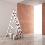
Essential Safety Considerations While Painting Your Space
February 7, 2024
What Color Should I Paint My Kitchen? Expert Tips Revealed
March 25, 2024
Opting for the perfect hue for your sleeping sanctuary isn’t merely about favoring a color; it’s intricately tied to constructing an ambiance that mirrors who you are and uplifts your spirits. Exploring the realm of color will reveal its power to sway feelings, unravel the mind’s associations with favored tones, and keep you aligned with modern style trends for a living area that’s both up-to-date and inviting. Moreover, we delve into the nitty-gritty details like how illumination alters the way colors are perceived, concocting bespoke hues through blending, opting for an appropriate paint sheen that marries longevity with visual appeal, leveraging online resources for pre-visualizing your choices, and getting your space primed and ready for a fresh coat. This guide aims to demystify the process from start to finish.
Table of Contents:
- Understanding the Impact of Color on Mood
- The Psychology Behind Bedroom Colors
- Top Trends in Bedroom Paint Colors for This Year
- How Lighting Affects Your Color Choice
- Combining Colors for a Unique Bedroom Style
- Practical Tips for Choosing the Right Paint Finish
- Navigating Color Selection Tools and Resources
- Preparing Your Bedroom for Painting
- FAQs About What Color Should I Paint My Bedroom
Understanding the Impact of Color on Mood
Colors do more than just fill spaces; they stir emotions and affect our daily lives. Imagine walking into a room painted in calming blues, and instantly feeling your stress melt away. That’s the power of color at play.
The Psychology Behind Bedroom Colors
Picking the right color for your bedroom isn’t just about what looks good. Choosing the color of your bedroom goes beyond aesthetics; it’s deeply connected to the emotions and sensations it evokes within you. For instance, blue hues are not only pleasing to the eye but are known to reduce stress levels, making them perfect for bedrooms. Studies have shown that people sleeping in rooms painted blue tend to have longer, more restful sleep compared to other colors.
On the flip side, vibrant colors like red may seem exciting but can increase heart rate and energy levels – not exactly what you want when trying to wind down after a long day.
Top Trends in Bedroom Paint Colors for This Year
This year is all about bringing nature indoors with earthy tones leading the way. Think soft greens that remind you of spring leaves or warm terracottas that echo sunsets. The hues not only rejuvenate the eye but also infuse a tranquil vibe into your living area, acting as a silent whisper of peace and quietude.
Pantone’s Color of The Year, Ultimate Gray paired with Illuminating (a bright yellow), highlights this trend towards warmth and optimism.
To keep up with trends while ensuring a peaceful slumber sanctuary, consider incorporating these shades through accent walls or decor if painting your entire room feels like too big a leap.
The Psychology Behind Bedroom Colors
Shades in your sleeping quarters transcend mere preference, embodying a realm of scientific intrigue. This space is your sanctuary, and choosing the right color can be like picking the perfect soundtrack for your relaxation playlist.
Understanding the Impact of Color on Mood
The way hues sway our emotions is truly captivating, isn’t it? Warm hues like reds and oranges spark energy and excitement but might not be what you want in a place meant for rest. On the flip side, cool tones such as blues and greens tend to soothe the soul, making them ideal contenders for bedroom walls.
A study highlighted by Psychology Today explains that blue can lower heart rates while red does quite the opposite. So if you’re aiming for tranquility (and let’s face it, who isn’t?), shades of blue might just do the trick.
The Psychology Behind Bedroom Colors
Diving deeper into psychology, certain colors can affect sleep quality too. Ever wonder why many sleeping pills are blue? It’s no coincidence. Blue promotes calmness which helps signal to your body that it’s time to wind down.
In contrast, vibrant colors like yellow or orange may offer an initial burst of joy but could potentially lead to overstimulation before bedtime – something worth considering before turning those sunny shades loose in your bedroom.
Navigating Color Selection Tools and Resources
- Pantone Connect lets users explore endless palettes with ease.
- Behr Paint Your Place offers realistic digital previews using photos from your own space.
- Sherwin-Williams’ ColorSnap Visualizer allows you to match paint hues with items from any picture.
Top Trends in Bedroom Paint Colors for This Year
Choosing the right paint color for your bedroom is like picking out what you’re going to wear to a job interview. Your choice in bedroom hue speaks volumes about your persona and lays the groundwork for the ambiance you’ll experience upon each entry. In 2024, the favored hues for our sanctuaries emphasize a communal yearning for coziness, tranquility, and a sprinkle of hopefulness.
The Psychology Behind Bedroom Colors
Before we dive into this year’s hottest hues, let’s talk about why color matters. Research has revealed that specific shades can sway our emotions and the caliber of our slumber. For example, the soothing nature of blue shades can lower stress, making them an ideal choice for bedroom settings. On the flip side, vibrant reds might be too stimulating before bedtime.
To understand more about how specific shades affect us psychologically, Color Psychology offers insights on choosing hues that align with your desired emotional ambiance.
How Lighting Affects Your Color Choice
Picking out a paint color without considering lighting is like buying shoes online without checking the size chart—risky business. Natural light makes colors appear differently than artificial lighting does; so what looks good in store under fluorescent lights may not look as nice in your dimly lit bedroom at home.
A helpful tip is to test swatches on different walls at various times of the day or check out Benjamin Moore’s Color A Room tool, which lets you visualize how shades change with light conditions.
Navigating Color Selection Tools and Resources
If picking just one color feels overwhelming don’t fret because there are plenty of digital tools designed to make this process easier. Apps like ProjectColor by Home Depot allow users to upload photos of their space and then virtually apply different paint options, helping visualize potential outcomes before committing. Plus, many brands offer sample pots; use these mini cans to test patches directly on bedroom walls to see live results.
How Lighting Affects Your Color Choice
Natural and artificial lighting can dramatically alter how a color looks on your walls, turning what you thought was the perfect hue into something entirely different.
Natural Light: The Great Revealer
Natural light changes in intensity and tone over a day. Morning light tends to be cooler, while afternoon light brings warmer tones. This means colors can appear differently at various times—what’s vibrant in the morning might look muted by evening. For instance, east-facing rooms get bright morning light, making cool colors sparkle but potentially washing out softer hues.
To get this balance right, test paint samples in different corners of your room at various times of the day. Observing these patches ensures the chosen hue remains consistent in diverse daylight scenarios.
Artificial Lighting: Setting The Mood
The type of bulbs used in a room also impacts how paint colors are perceived. LED lights offer a wide range of temperature settings from warm yellows to crisp whites which can enhance or mute wall colors accordingly. Learn more about LED lighting options #. Incandescent bulbs cast warm glows enhancing reds and oranges but may dull blues and greens.
Mixing bulb types within one space without testing could lead to unpredictable results with your chosen paint shade. When selecting new shades for your bedroom consider both sources – natural daylight plus any artificial lights- as they collectively influence the final appearance.
Combining Colors for a Unique Bedroom Style
Choosing the right colors for your bedroom isn’t just about picking your favorite shades. Crafting the perfect bedroom palette involves a blend of psychological insights, contemporary design movements, and your unique flavor to forge an environment that truly mirrors your essence. But don’t worry; we’re here to help make this process as easy as pie.
The Psychology Behind Bedroom Colors
Various hues have the power to stir up distinct emotions and sensations within us. For instance, the shade of blue tends to evoke a sense of tranquility and peace, which is why many opt for it when decorating their sleeping quarters. On the other hand, vibrant hues like orange or red might energize some but could be too stimulating for others when winding down at night. To find out more about how color affects mood, take a look at this detailed guide on color psychology.
Considering what mood you want to set in your bedroom is key before diving into paint swatches. Whether you’re aiming for a peaceful retreat or a cozy hideaway will greatly influence your color choices.
Top Trends in Bedroom Paint Colors for This Year
Maintaining a contemporary vibe in your bedroom necessitates keeping pace with the evolving palette of popular hues. Soft pastels are making a comeback this year, bringing airy lightness into spaces. Earth tones continue to rise in popularity as well—think sage green or terracotta—for those seeking warmth and grounding vibes.
If keeping up with every trend feels overwhelming though, Pinterest boards on bedroom paint colors can offer endless inspiration tailored specifically to current styles without overloading yourself with options.
Navigating Color Selection Tools and Resources
Picking the perfect palette goes beyond imagination—you need tools. Digital apps like Benjamin Moore’s Color Capture® app, let users snap pictures of anything inspiring them before matching it to real paint colors available from their collections.
This kind of tech makes visualizing easier than ever before but remember: screens can alter how true-to-life these hues appear due mainly to lighting differences so always double-check samples under various conditions within actual rooms where they’ll live.
Practical Tips for Choosing the Right Paint Finish
Choosing the right paint finish for your bedroom is like picking the perfect outfit. Selecting a paint finish goes beyond hue; it encompasses the feel, resilience, and ambiance it brings to your space. The wrong finish can make a high-quality paint job look mediocre.
The Importance of Durability
In spaces frequented by bustling activity, the endurance of materials used becomes paramount. While bedrooms might not be as prone to spills as kitchens or mudrooms, think about cleaning requirements. Matte finishes hide imperfections but show dirt and smudges more easily than glossier options. On the flip side, glossy finishes are easier to clean but highlight every bump on your walls.
To find a balance between durability and aesthetics, many homeowners opt for an eggshell or satin finish in their bedrooms. Opting for these finishes brings a subtle luster that simplifies cleaning without harshly exposing wall flaws.
Maintenance Matters
Maintenance goes hand-in-hand with durability when selecting your paint finish. Consider how often you’re willing to touch up or repaint your walls.
- Eggshell and satin finishes provide moderate ease of maintenance without being too shiny,
- Semi-gloss and gloss are great for trim work because they stand up well against routine cleaning,
A visit to Consumer Reports’ guide on paints offers detailed comparisons of different types of finishes and their recommended applications.
Aesthetic Appeal Is Key
Gloss levels affect how colors appear under different lighting conditions. Rooms with less light can feel more welcoming and vibrant when you use paint that has a higher sheen, bouncing back more illumination.
Navigating Color Selection Tools and Resources
Choosing the right color for your bedroom isn’t just about picking your favorite shade. Selecting the perfect hue for your sleeping quarters is both a meticulous study and a creative endeavor, enhanced by the latest tech aids to streamline the process. Gone are the days when you had to rely solely on paint chips under store lighting. Nowadays, we’re equipped with electronic gadgets that empower us to preview the transformation of hues in our environments.
One such tool is Benjamin Moore’s Personal Color Viewer. This nifty app allows you to upload photos of your bedroom and experiment with thousands of colors. It takes out much of the guesswork by giving you a pretty accurate preview of the outcome.
Another great resource is Sherwin-Williams’ ColorSnap Visualizer. Not only can it match paint colors to elements in your existing decor, but it also suggests complementary shades. This means if you’re stumped on what accent colors might work with your main choice, help is just a few clicks away.
Last but not least, don’t overlook Pinterest as a source of inspiration. While not technically a tool for visualizing specific paint brands or shades in your room, its vast collection of interior design ideas can spark creativity and guide you toward color schemes that resonate with your style.
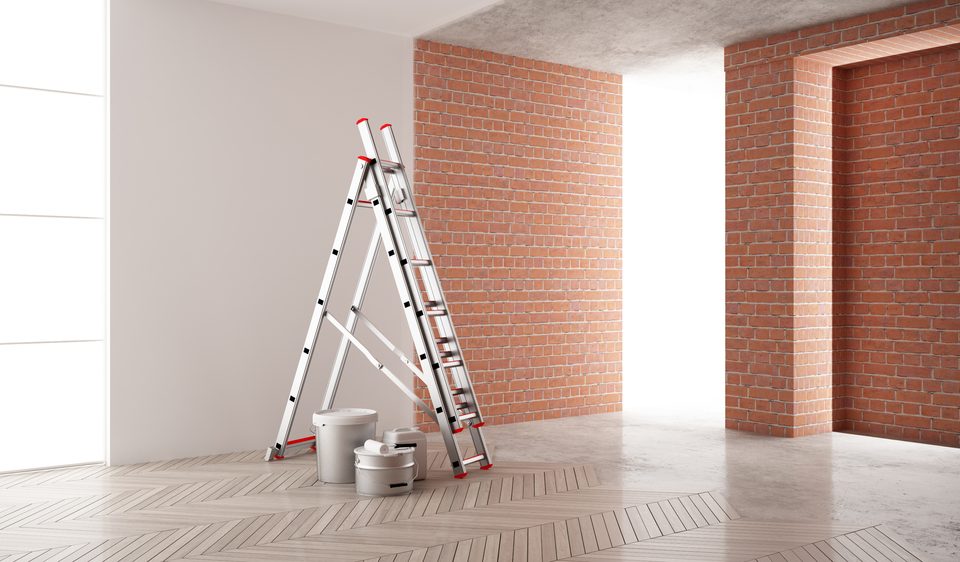
Preparing Your Bedroom for Painting
Moving furniture out of the way is your first step. It sounds obvious, but you’d be surprised how many people think they can paint around a dresser. Spoiler alert: it doesn’t work well. If moving everything out isn’t an option, push it all to the center and cover it with a drop cloth.
Now, let’s shift our focus to safeguarding your flooring. Even if you’re the next Picasso of wall painting, drips happen. A sturdy canvas drop cloth on the floor beats plastic every time – plastic shifts and can lead to more spills.
Last but not least is taping off edges and trim work for those crisp lines that make your room look professionally done. Use painter’s tape instead of masking tape for better adhesion and easier removal without leaving residue or peeling off bits of paint or drywall.
To ensure smooth application, prep your walls too. Fill any holes or cracks with spackle, then sand them down once dry – nobody wants their new color to highlight imperfections. And don’t forget to wash your walls; even dust can mess up a good paint job.
A final piece often overlooked? Lighting matters when painting. Adequate illumination is key in spotting any overlooked areas and maintaining uniformity in hue across the surface. This Old House offers great tips on setting up proper lighting before you start painting.
FAQs About What Color Should I Paint My Bedroom
Which paint color is best for bedroom?
Soft blues and greens win for bedrooms. They offer a serene vibe, helping you chill out and sleep better.
What is the best color type for a bedroom?
Pastels or muted colors rock in bedrooms. They make spaces feel cozy without overpowering your eyes when winding down.
What colour is the most relaxing for a bedroom?
Cool blue takes the crown. It’s like gazing at the sky or ocean, easing stress and inviting calm snoozes.
Should bedroom paint be lighter or darker?
Go lighter to open up small spaces and boost light. Darker shades are great for creating a snug, intimate vibe.
Picking the right paint for your bedroom goes beyond preference. It’s about setting a mood, enhancing sleep, and expressing yourself.
The hues we surround ourselves with have a profound ability to influence our emotions in distinct manners. Remember, blue calms while red energizes.
This year’s trends offer exciting options but always consider lighting; it changes everything.
Mixing colors can truly make your space yours. Don’t forget to pick the finish that matches both looks and life.
Digital tools are there to help visualize before you commit. When ready, prep makes it perfect for painting success.
In deciding what color should I paint my bedroom, know it shapes your sanctuary. Start with what feels good because, after all, this is where every day begins and ends.
