
Should I Use a Sprayer to Paint My House? Pros and Cons
August 28, 2023
Can You Paint Interior When It Rains? Your Wet Weather Guide
September 18, 2023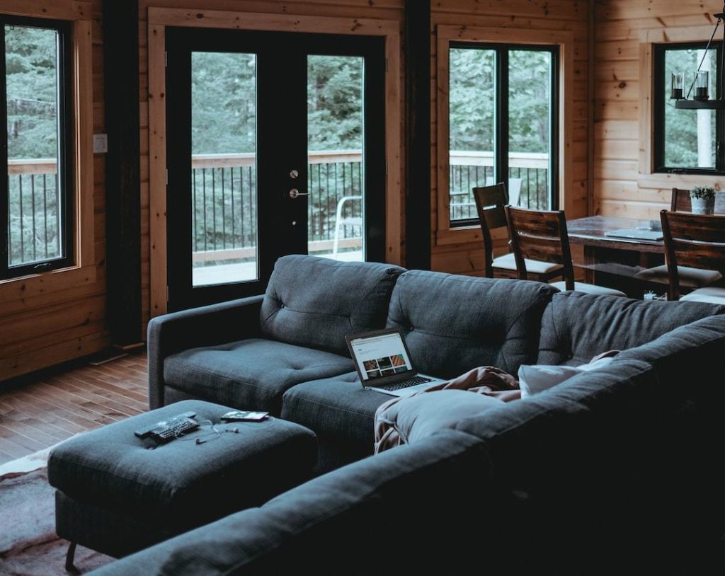
Knowing how to choose interior paint colors and schemes can make or break the ambiance of your home.
The perfect color scheme sets the mood, influences perception, and enhances architectural features. But where do you start?
You’re probably familiar with basic color theory; nailing down the right palette involves more than just picking your favorite hues.
Choosing interior paint colors and schemes requires a careful balance of artistry and science.
Table of Contents:
- Understanding Your Room’s Lighting: The Key to Choosing Exceptional Interior Paint Colors
- Consider Your Room’s Purpose
- Choosing the Perfect Interior Paint Colors and Schemes
- Use Neutral Colors as Accents
- Choosing the Perfect Interior Paint Colors and Schemes
- Choosing the Perfect Interior Paint Colors and Schemes
- FAQs in Relation to How to Choose Interior Paint Colors and Schemes
- Conclusion
Understanding Your Room’s Lighting: The Key to Choosing Exceptional Interior Paint Colors
When painting your room, understanding the impact of light is crucial. But how does lighting influence paint colors? Let’s dive into the details.
Natural Light: The Sun’s Impact on Color Perception
The sun can play tricks with your eyes when perceiving color. For instance, a room bathed in sunlight from north-facing windows may give warm tones an extra glow, while south-facing rooms intensify all hues due to their direct exposure.
“It’s fascinating how different types of natural light can change our perception of color.”
In essence, considering the direction and intensity of natural light entering your space will help you select suitable paint colors for each area.
Artificial Light: Illuminating Effects on Paint Colors
Beyond sunlight, artificial lights also interact differently with various shades. Incandescent bulbs enhance warmer hues, whereas fluorescent lighting emphasizes cool blues and greens. Learn more about this topic here.
Picking Colors According to Lighting Conditions: The Art and Science Combined
Selecting appropriate colors according to differing lighting conditions isn’t merely science – artistry is also involved. Spaces rich in illumination could carry darker shades better than poorly lit areas might; conversely, bright spaces often benefit from less saturated or softer hues so they don’t appear overly intense or harsh.
This paints a picture (pun intended) as clear as day – understanding your room’s unique interaction with natural and artificial light plays a pivotal role in selecting the perfect interior paint colors. Now let’s move forward to another vital factor affecting the choice of paints – the purpose served by each individual room within your home…
Natural and artificial lighting plays a significant role in choosing the right interior paint colors. Sunlight can alter color perception based on window direction, while artificial lights interact differently with various hues. Thus, considering your room’s unique interaction with light is crucial for selecting perfect paint shades. Remember to test out different samples under varying lighting conditions.
Consider Your Room’s Purpose
In the interior design world, a room’s purpose significantly influences its color palette. So how does one navigate this nuanced terrain? Let’s delve into it.
The Mood You Want to Set
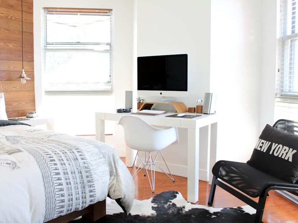
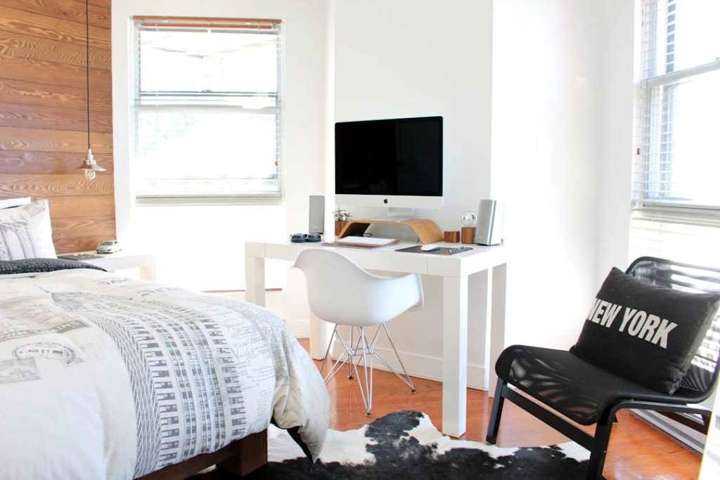
Consider the atmosphere you want to create when selecting paint colors for your interiors. For instance, bedrooms are often associated with tranquility and relaxation – cool tones like blues or greens can be perfect. On the other hand, if we’re talking about an office space where focus is essential, neutral hues such as grays or beiges could work wonders.
“The psychology of color is real and has been proven by various studies.”
The Level of Activity in a Room Matters Too.
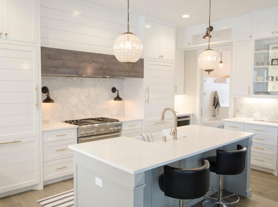
A high-traffic area like a kitchen may require energizing shades that invigorate those who enter, while less frequented spaces like study rooms might benefit from subdued hues that promote concentration.
Natural Light: A Key Player in Color Selection
Natural light availability also plays an important role when choosing paint colors for your interiors. Rooms bathed in sunlight can handle darker colors without seeming gloomy, whereas poorly lit rooms fare better with lighter shades reflecting more light.
As you can see, there are multiple factors at play when deciding on paint colors for each specific room in your home – it goes beyond mere aesthetics.
Now armed with these insights, let’s move on to another critical aspect – devising harmonious color schemes.
Choose the Perfect Interior Paint Colors and Schemes
Explore color theory, designer tips, and lighting impacts to transform your space.
Choose a Color Scheme
Selecting the right color scheme for your interior paint job is essential to achieving a cohesive and aesthetically pleasing home environment. Selecting shades for your interior painting isn’t just about picking out what you like; it requires more than that.
The first step in this journey? Taking stock of what’s already there. Assess the dominant hues present in your space – furniture, artwork, rugs, or even small accessories can serve as inspiration when choosing complementary paint colors.
Navigate Through Different Color Schemes
In terms of color schemes, you’re looking at two primary options: monochromatic or analogous. Monochromatic schemes revolve around different shades from one base color; it creates a soothing effect that works well in bedrooms and bathrooms. On the other hand, analogous schemes use adjacent colors on the wheel to create vibrant yet harmonious interiors perfect for living rooms and kitchens.
Evaluate Your Lighting Conditions
Don’t overlook lighting conditions when deciding on paint colors for your home’s interior spaces. The interaction between natural light and specific hues significantly affects how they appear throughout various times of day – something worth considering before making final decisions.
Mindful Room Functionality
Your chosen paint should also reflect each room’s functionality – calming tones like blues or greens are great for bedrooms, while brighter hues might better suit living areas where you want more energy. In essence, selecting appropriate interior paints isn’t solely about aesthetics; it also plays an integral role in enhancing comfort levels.
Test Paint Colors
Before diving headfirst into painting all walls with selected shades, though, we highly recommend testing potential choices directly onto smaller sections…
Choosing the perfect interior paint colors and schemes involves a blend of color theory, lighting considerations, and room functionality. Begin by examining your space’s existing elements for inspiration. Decide between monochromatic or analogous color schemes based on the desired ambiance. Consider how natural light affects hues at different times of day before making final choices. Remember to align the paint selection with each room’s purpose.
Choosing the Perfect Interior Paint Colors and Schemes
Selecting the right colors for painting your interior walls can be challenging, but you can easily find the ideal color scheme with some guidance. Nevertheless, with some direction, you can easily traverse the realm of wall paints and discover an ideal color scheme for your abode. Here’s a step-by-step guide to help you along the way:
1. Understand Why Testing Is Crucial
The first step in your paint selection journey is understanding the importance of testing paint colors. It’s essential to see how different shades look under various lighting conditions and against other elements in your space. To do this, we recommend painting test patches on your wall with potential hues before making any commitments. This will help you visualize how the colors translate into the room and ensure you make the right choice.
2. Choose Lighter Shades First
When testing out colors, it’s best to start with lighter shades. This allows for easier adjustments later on if needed. Lighter colors are also more forgiving and easier to cover up, minimizing wasting time and resources during experimentation.
Picking Sample Sizes Over Full Cans
- Avoid purchasing full cans of paint for initial tests. Instead, opt for sample sizes that most manufacturers offer. These smaller sizes provide enough quantity for effective testing without leading to excess unused material or cost overruns.
- You can try out different colors using sample sizes without committing to a large quantity of paint.
Making The Final Decision
When choosing the perfect color scheme, remember that personal preference always trumps trends. It’s important that the colors you choose resonate with your personality and create a sense of comfort in your living spaces. Trust your intuition and make the decision that best suits you.
As we transition into our next topic about using neutral tones as accents, keep these tips in mind. A subtle change in color can make all the difference. While neutrals may seem less exciting initially, their impact can be surprisingly transformative.
Choosing the right interior paint colors can seem intimidating, but it doesn’t have to be. Remember that testing is key; try different shades under various lighting conditions before deciding. Start with lighter hues for easy adjustments and less wastage. Use sample sizes instead of full cans for initial tests to avoid excess costs or unused material.
Use Neutral Colors as Accents
The interior design of your home can be significantly enhanced by using neutral colors as accents. This method provides depth and texture to any room without overwhelming it with color.
Why Neutrals?
Neutral shades like beige, gray, or white are incredibly versatile. They provide the perfect backdrop for showcasing furniture and art pieces because they don’t compete with other elements in the room.
In addition, neutrals uniquely make small spaces appear larger while giving large rooms a cozy feel. It’s all about using them strategically to manipulate perceptions of space without resorting to major renovations.
Selecting Your Accent Color
Picking the right neutral accent involves considering lighting conditions, existing decor elements, and personal preference. For instance, if your room gets plenty of natural light during the day but lacks warmth at night due to artificial lighting fixtures, warmer tones might be more suitable than cooler ones.
To determine which neutral hue would best suit your needs, consider utilizing digital tools like online paint visualizers or seeking professional advice from experts who specialize in helping homeowners choose their ideal paint scheme. Book a consultation today.
Mixing Neutrals With Other Hues
A common misconception is that neutrals must stand alone. However, this isn’t necessarily true; pairing them up with bolder hues creates contrast, adding interest to otherwise monotonous schemes, thus bringing out the unique character within each shade used together.
This technique also provides an opportunity for future changes since updating accent colors becomes easier when the main wall remains constant over time, thanks to its neutrality feature providing flexibility in design choices going forward.
Learn more about mixing neutrals here.
As we continue exploring effective ways to utilize color in interior designs, the next step will focus on effectively balancing warm and cool tones to create an inviting look in any room. Stay tuned to find out how.
Neutral shades aren’t just wallflowers; they’re the unsung heroes of interior design. These versatile hues are used as accents and add depth and texture without stealing the show from your furniture or art pieces. They can also manipulate perceptions of space, making small rooms appear cozier and larger ones. Pair them with bolder colors for contrast, and you win.
Choosing the Perfect Interior Paint Colors and Schemes
Explore color theory, designer tips, and lighting impacts to transform your space.
Balance Warm and Cool Tones
Creating a harmonious interior space involves the delicate art of balancing warm and cool tones. One can create a visually appealing atmosphere by blending warm hues such as reds, oranges, and yellows with cooler tones of blues, greens, and purples.
The Influence of Warm Colors in Interior Design
A dash of warm colors brings vibrancy to your interiors. They are reminiscent of energy and dynamism. Reds spark conversations, making them ideal for social interactions, like living rooms or dining areas.
The welcoming aura radiated by oranges makes them perfect for entryways or hallways, while yellows stimulate creativity – excellent choices for kitchens or home offices where positivity is crucial.
Melding Cool Colors into Your Space
Cool shades, on the other hand, introduce tranquility to your environment. Blues evoke images of serene water bodies, providing a peaceful ambiance suitable for bedrooms or bathrooms.
Greens reflect nature, inducing relaxation, which works well in study rooms that require concentration. Purples balance blue’s stability with red’s vigor; they work wonders in spaces like dens or studios.
“Finding balance between warm and cool tones isn’t just about aesthetics; it affects how you feel within those walls.”
Sherwin Williams Project Center provides countless examples demonstrating balanced color schemes.
As we delve deeper into creating remarkable interiors, let’s consider another key element: texture. Our upcoming section will discuss incorporating different finishes, and adding depth to enhance visual interest.
Choosing the Perfect Interior Paint Colors and Schemes
Explore color theory, designer tips, and lighting impacts to transform your space.
Adding Texture to Your Interior Design
Interior design is all about layering elements to create a visually stimulating space. One such element that can greatly impact your room’s overall look and feel is texture, particularly through different paint finishes like matte, eggshell, or satin.
Matte Finish: The Unsung Hero in Hiding Imperfections
A well-known secret among designers is how effectively a matte finish can hide wall imperfections. Its low-sheen quality gives it this unique advantage while offering an understated elegance. Despite its benefits, remember that this type of finish tends to show dirt and scuffs more easily than others, which may necessitate frequent touch-ups for high-traffic areas.
“The subtlety and sophistication offered by a matte finish are often underappreciated.”
Eggshell Finish: Striking the Balance Between Aesthetics & Durability
Another popular choice among homeowners seeking a balance between visual appeal and durability is an eggshell finish. As its name suggests, this option offers a slight luster like an eggshell. Its minimal shine allows light reflection without compromising its ability to mask minor blemishes. What sets it apart from other options, especially matte paints, is how much easier it cleans up – making it ideal for busier spaces within your home.
Satin Finish: For Those Who Desire Subtle Elegance & Easy Maintenance
| Type Of Paint Finishes: |
|---|
| Searching for a touch of shimmer but not too flashy? You’re in the right place. |
Mastering the art of interior paint colors and schemes is about exploring color theory, considering lighting impacts, and learning from designer tips. Remember that texture plays a significant role in your design – with different paint finishes like matte, eggshell, or satin adding unique touches. Matte finish is great for hiding wall imperfections but requires frequent touch-ups in high-traffic areas.
FAQs in Relation to How to Choose Interior Paint Colors and Schemes
Choosing the Perfect Interior Paint Colors and Schemes
Explore color theory, designer tips, and lighting impacts to transform your space.
How do I choose the right color palette for my interior?
Select a base color you love, then build your palette with complementary or analogous colors. Consider room function and lighting when choosing hues.
What is the 3 color rule in interior design?
The 3-color rule suggests using a primary color for walls, a secondary for large furniture, and accent colors for accessories to create balance.
Should your whole house have the same color scheme?
No, each room can have its own scheme. However, ensure flow by tying rooms with similar undertones or accents.
How do you coordinate interior paint colors?
Create harmony by matching wall paint with elements like flooring or furniture. Use a mix of warm and cool tones balanced through different spaces.
Conclusion
Mastering the art of choosing interior paint colors and schemes can significantly impact your home decor. Understanding how lighting affects color perception is key. When selecting colors, always consider the purpose of each room to create the desired atmosphere. It’s important to pick a color scheme that complements the existing elements in your space, enhancing its overall appeal.
Before fully committing to a color, it’s wise to test out paint samples on small wall areas first. This allows you to see how the color looks in different lighting conditions and how it interacts with the other elements in the room. Don’t underestimate the power of neutral tones; they can add depth to a space without overwhelming the senses.
Creating a balanced color palette involves incorporating both warm and cool hues. This achieves the inviting ambiance that we all love in our homes. Additionally, you can add texture to your walls by experimenting with different finishes such as matte, eggshell, or satin. These finishes can give your space a unique and interesting look.
If you’re looking for a professional painter who understands the intricacies of color selection, Matt The Painter is here to help. With exceptional house painting experiences tailored to reflect your unique style